
Latest in: Announcements
Bialosky + Partners Architects recently earned a Merit Award at the 2015 AIA/IIDA Cleveland Design Awards, for conceptual planning and design of The Midway Bicycle Network for a stakeholder group led by Bike Cleveland. Thanks to all involved, in …

November 24, 2015

Fifteen projects in fifteen years – We are proud to be working once again with Tri-C! Bialosky + Partners Architects was recently awarded the Metro Campus Center project, sited on E. 30th in downtown …

September 21, 2015

Event Newstand It took six designers three months of planning and countless hours of creating, but the Bialosky + Partners / Ohio Desk team took home the People’s Choice Award at the IIDA Cleveland …

May 18, 2015

BPA would like to thank our sponsors for their generous donations. Thanks to their help we were able to raise $4,390 and purchase over 4,188 cans of food to donate to the Greater Cleveland …
April 7, 2015

Bialosky + Partners Architects (BPA) is excited to once again participate in this year’s Cleveland 2015 Canstruction Design/Build competition, which benefits the Cleveland Foodbank during their Harvest for Hunger Campaign. Canstruction, a national charity …
February 2, 2015

In true Cleveland fashion, winter is once again upon us and bringing the cold and snow weeks earlier than anyone ever wants. Here at Bialosky + Partners, we responded to this chilly arrival the …
December 9, 2014

This week is your last chance to view the breathtaking art exhibit “Stone, Wave, Dream: Three Artists, Three Worlds”. Featuring acrylic paintings from our very own Jack Alan Bialosky, Sr., the expansive collection captures majestic …
December 2, 2014
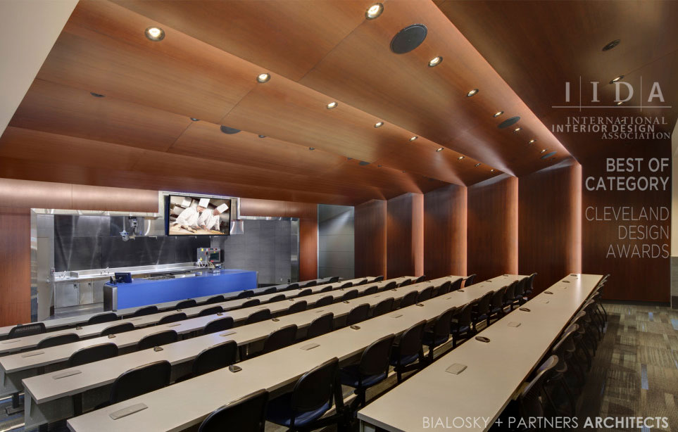
Bialosky + Partners received a 2014 design award from the Cleveland Chapter of the International Interior Design Association (IIDA) for Best of Category in Education for the Lorain County Community College Ben & Jane Norton Culinary Arts …
November 24, 2014

AIA Ohio Convention 2014 Bialosky + Partners Architects This week, Bialosky + Partners Architects will lead sessions at the 2014 AIA Ohio Convention, in Kent, OH that tackle the theme of "A Future Practice". Senior and Managing Principal …
September 17, 2014

We are excited to share that Bialosky + Partners has been featured in the IIDA Cleveland Akron City Center Newsletter and website’s “Talk of the Town” column. The article profiles Cuyahoga Community College (CCC)’s …

September 10, 2014