


The National Organization of Minority Architects (NOMA) is centered on building a strong national organization, strong chapters, and strong members in order to drive design professionals to minimize discrimination in the industry. And the Cleveland Chapter is aiming to do just that – the unofficial chapter’s membership has declined over the years, and is suiting-up for its comeback. In the midst of becoming official, the chapter is doing the prep-work for becoming a strong foundation to motivate minority involvement in Northeast Ohio politics, civic forums, and youth mentorship programs. Branding and awareness is a big part of that. Earlier this year, our very own James Cowan started re-branding the Cleveland Chapter of NOMA. I sat down with James for a long-awaited interview about his role in reviving NOMA in Cleveland. HD: How did you stand-out from the crowd to be selected as the designer? JC: At the beginning of the NOMA meetings, we just began to delegate responsibilities. The members knew I had previous experience in creating other brands for Cleveland businesses, and enjoy graphic design as something extracurricular.
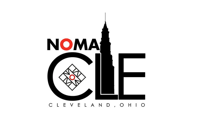
James' re-branding of the Cleveland Chapter of NOMA.
HD: What parameters did NOMA give for their new logo? What was the number one priority in the design? JC: “Just go at it” is what they said. The members gave me creative license with the design, and stressed the goal of creating an impactful identity. We have amazing origins, starting with Cleveland native Robert P. Madison, the first black registered architect in Ohio, and who has trained and mentored about 200 minority architects in his lifetime. At 90, he is still furthering awareness of African American history and culture, and continuing to build/shape a new Cleveland. NOMA Cleveland’s brand should resonate that “Cleveland is back”, and capture this recent resurgence. Early on, NOMA members liked the idea of incorporating the familiar “CLE” that has come to represent a love and pride of Cleveland. That became the one known in the composition. HD: And the design process? Does it start with pencil and paper? JC: I start with lists. I listed what pops out when I think about Cleveland, looking for strong iconic structures. The Detroit Superior Bridge, the lake, the Terminal Tower. I sketch it out, scan it, and then go to Photoshop/ Illustrator. After a design, I usually walk away from it for a few days, and come back to look at it with fresh eyes. I started with a complex design, using the bridge and the tower, knowing down the line it would be edited down. I review them with the chapter, and we boiled down the design to something clear and minimal. HD: When can we expect the chapter logo to roll out? JC: It is already being implemented in our letterheads, and the more complex version may still be used for t-shirts and the like. We quickly wanted this branding in place and set for new members. It is all about bringing awareness of NOMA to the region; it’s exciting be a part of increasing NOMA’s visibility.
No Comments.